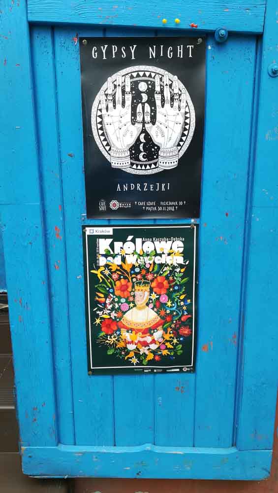
Then came a weekend in Cracow, with many inspirations that changed my vision for this project to a slightly different approch.
Poland has many great designers, at least that is the impression I had again when visiting Cracow at the end of November. Here are a few posters I came accross that I absolutely loved. The first one I like for it’s simplicity and the way the type is placed on top. The next ones I like for the way the animals are featured on the posters, and how the design makes use of bold shapes and different font sizes. I like the Gypsy Night layout because it has a similar theme to the one I’m working on, and it works well in black-and-white only.
The Literature and Film festival posters put an idea into my head: instead of representing the Roman gods with human-like figures, I wanted to show them as animals. During my research I had come accross the fact that many gods and goddesses had animals associated to them anyway (see sources here, here and here). I decided to match them each with an animal. Not always with the ones that are associated with them in history, but some I put e.g. because the animal represents the characteristic that is associated with a god.
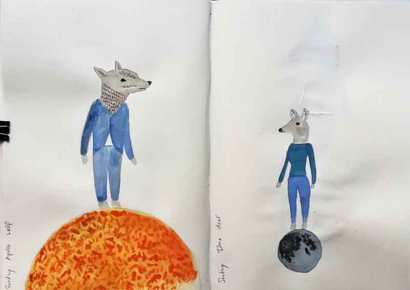
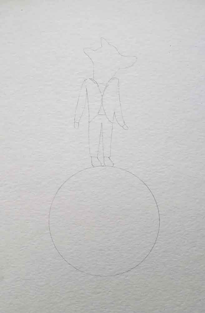
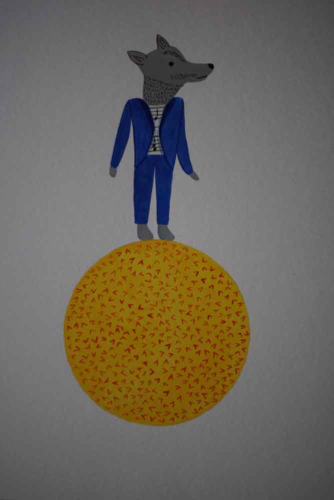
Apollo: Wolf; it’s one of the associated animals for Apollo, and while people might consider the link to be with the moon rather than the sun (“wherewolfs”), I think it is a fitting choice. A wolf is strong just like the sun.
Diana: Deer; because she is the goddess of hunting, and women, and because the deer is strong, yet vulnerable. Also, a deer is sometimes overlooked in the animal kingdom, just like the moon might be overlooked because of its smaller dimensions compared to the others.
Mars: horse; it’s an associated animal of the Roman god, and I think it fits well because horses were often used in wartime, they are proud, beautiful, strong, and are real fighters.
Mercury: bird; I decided to represent mercury as a bird because I found it would best represent the winged sandals of the Roman god. Also birds can be considered messangers, too.
Jupiter: lion; I chose this match to have the king of the animals represent the king of the gods. Lions are strong and powerful creatures.
Venus: dolphin; it’s one of the associated animal for the Roman goddess.
Saturn: ramgoat; I chose this match because Saturn rules the sign of Capricorn in astronomy.

Assignment 5 – Sketchbook
Assignment 5 – Sketchbook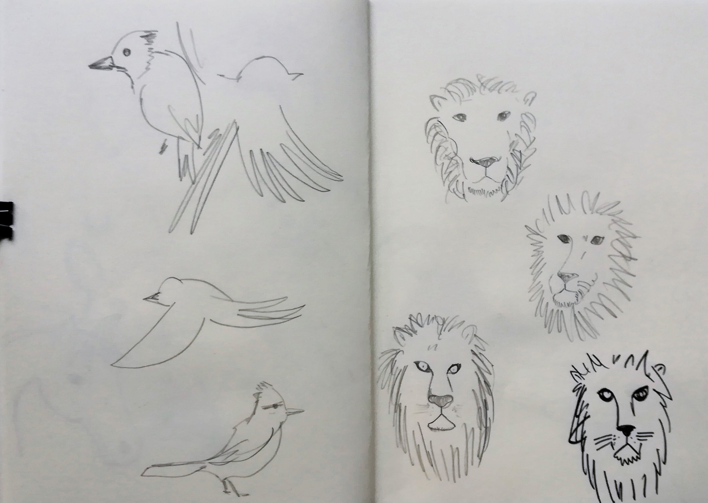
Assignment 5 – Sketchbook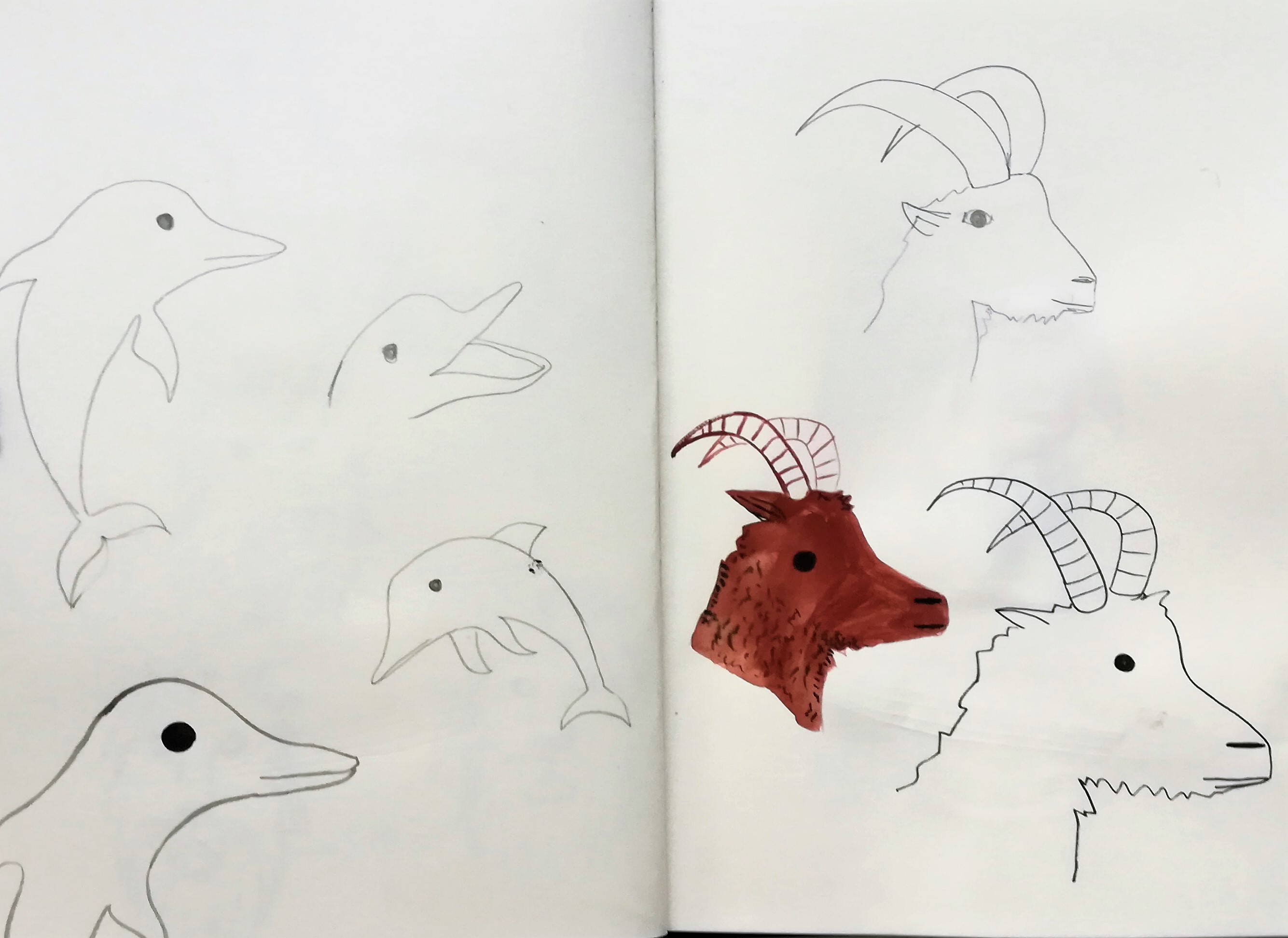
Assignment 5 – Sketchbook
I then worked on different materials on how to combine the animals with the planets. The first idea was to show the animals with outlines only, then in full colour, then as a collague with painted animals, and then the animals in grey. I asked several people and got different opinions which one looked best. They agreed that the one with the grey animal was the favourite.

Working out style 
Working out style
As mentioned earlier, I wanted to show the planets similar to their actual ratio, so I also tried to visualize this in my sketchbook.

I continued to make a colour sketch of each planet and animal in my sketchbook, keeping the planet ratio in mind. I found that keeping the animals in grey works well; they look very harmonic in my view, also because their “outfits” are kept to a similar colour scheme, and the planets also have a limited colour scheme with yellow-redish-brownish tones.
Assignment 5 – sketchbook 
Assignment 5 – sketchbook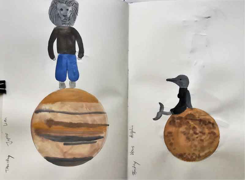
Assignment 5 – sketchbook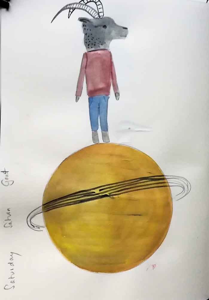
Assignment 5 – sketchbook
Afterwards I worked on each paintings in gouache, and later added details in ink. I felt this was the best wayto keep the texture smooth, and have the details stand out well. I also came back to the collage idea, and added some cut-outs of silver/gold/starry paper. Here are a few impressions of my work in progress with the paintings.
Work in progress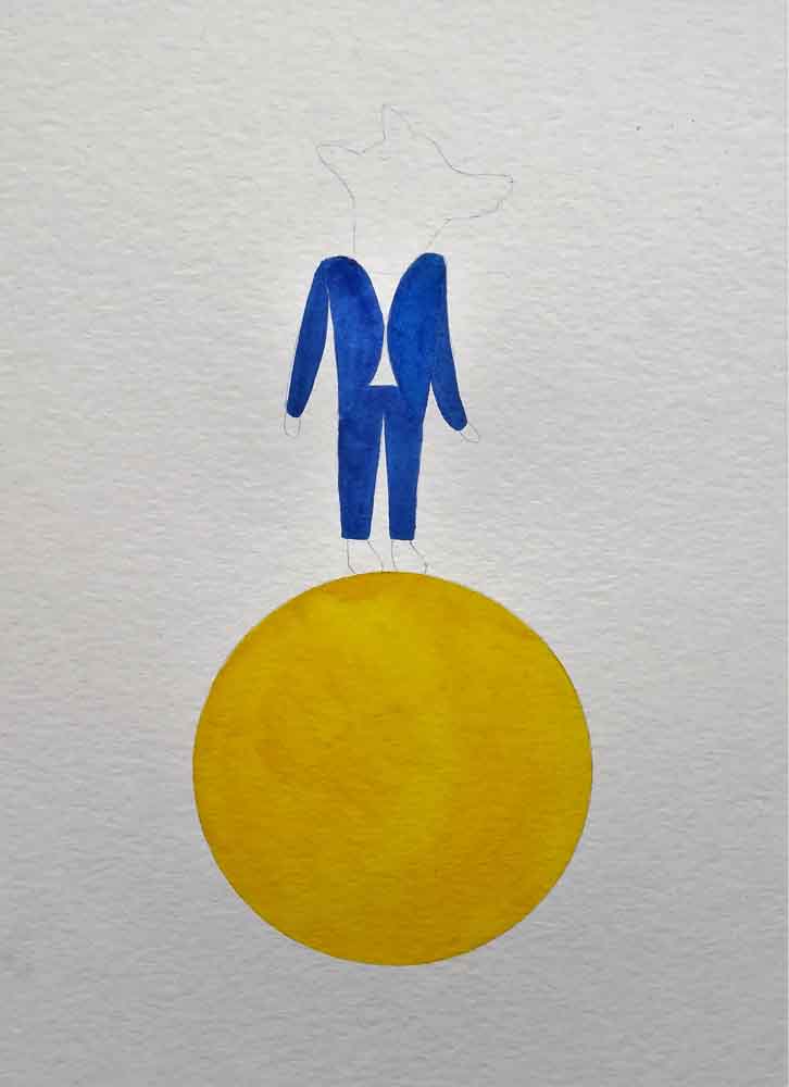
Work in progress
Work in progress
Work in progress
Work in progress
Work in progress
Work in progress
Work in progress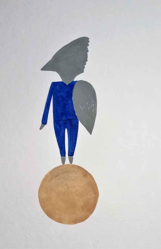
Work in progress
Work in progress
Finished paintings 
Finished paintings 
Finished paintings 
Finished paintings 
Finished paintings 
Finished paintings 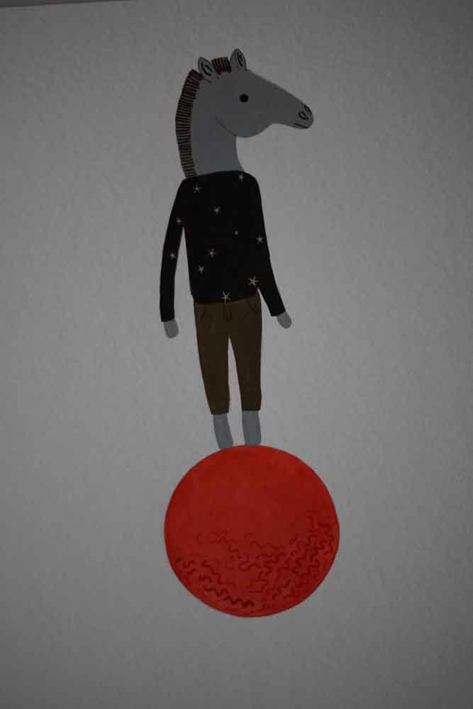
Finished paintings
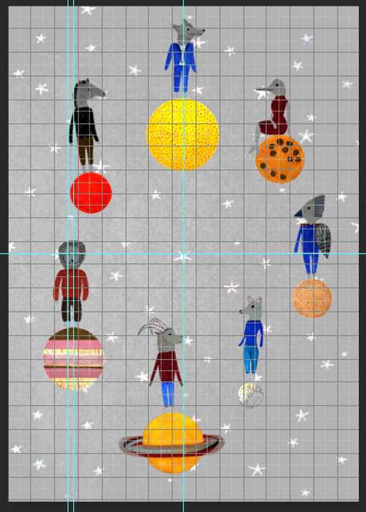
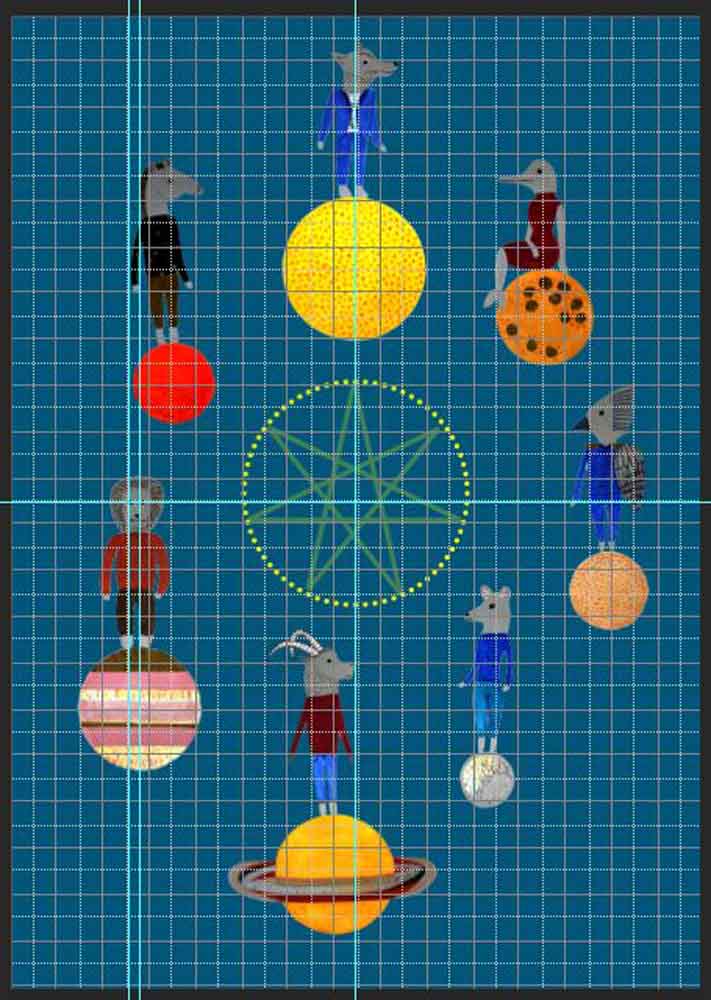
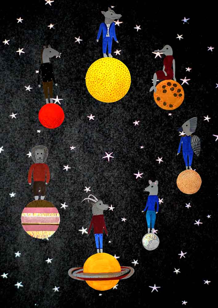
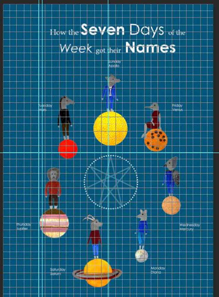
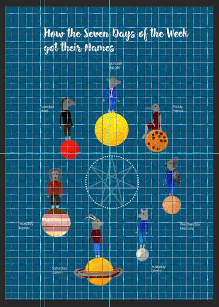
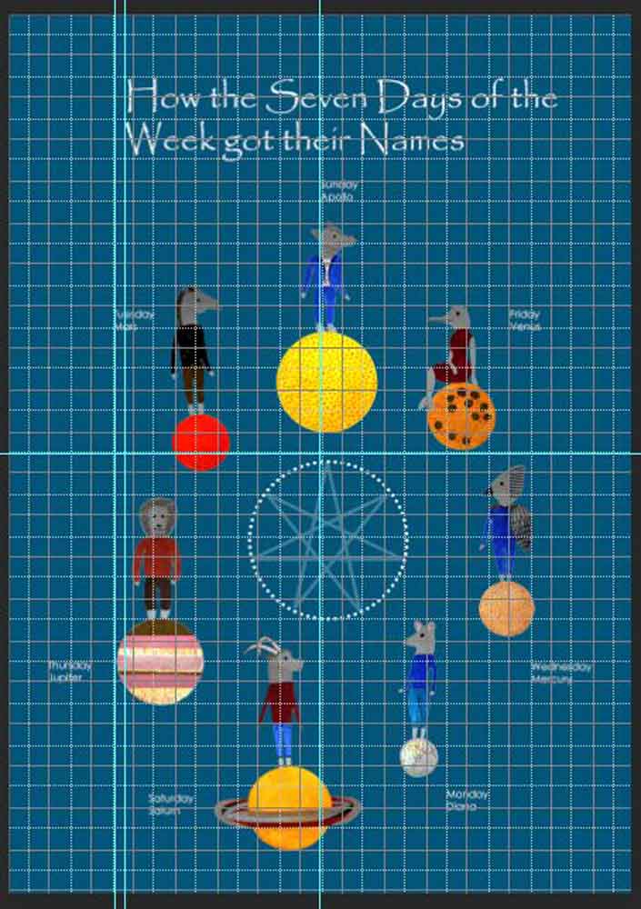
I then started processing the illustrations digitally in Photoshop, added more contrast, some more white balance, and some small retouches. I then worked on the editorial layout, and poster design somewhat simultaneously, as they should have the same layout, with the poster having some additional text details. Here are a few screenshots of the process. I worked on the circular layout as indicated in my thumbnails, and then played around with the background. I initially wanted to keep it clean, and thought the white background would be the best option, but then figured it looked a bit plain. I also tried the starry background, both in full black, and in a grey-scale. However, I found it too distracting, and decided to stick to a full background in one colour. I found the dark petrol blue to be quite fitting to the sky. It looks interesting, and is not to prominent to draw away the attention from the illustrations. I also tried out different versions of the astronomy symbol in the middle.
I then looked at different font options to accompany the illustration. I kept in mind that it should work in a magazine as well as a poster. I decided to take the oversion with the two different fonts (one with serifs, one sans-serifs) forward, because it is the most interesting – and derives from the poster inspirations from Cracow.
In InDesign I worked on the editorial layout, in which I wanted to include the illustration, as well as the small paintings next to the explanation for each weekday.
For the poster, I shifted the copy around and aimed at having the names in one line, but then decided to move the Sunday copy into the middle.
References


