
This exercise focuses on editorial illustration as this is a broad area and often gives illustrators the freedom to work on a piece freely within a certain brief / topic.
Firsty I looked at a few daily and weekly newspapers, including German weekly “Die Zeit”, German daily “Süddeutsche Zeitung” as well as Financial Times, and reviewed their way of including illustrations.
Generally I found that all newspapers don’t include a vast number of illustrations. Instead they use photographs to accompany the articles. I believe this is mainly because both the weekly and daily newspapers focus a lot more on the current events in economics and politics. They receive many photographs from these areas and due to the fast production process, it is easier to include a photograph than to create an illustration for a timely subject.
The illustrations that were included mainly focus on subjects that were not that time-pressing, and whose topics were probably prepared over a longer time period. This includes feature articles/analyses, and topics mainly focus on arts and literature, leisure, and society. Here is an overview (picture credit: Die Zeit; Süddeutsche Zeitung print editions):
")
")
")
")
")
")
")
The illustrations are mainly used to visually accompany the text, and draw the reader’s eye to the article. The text is usually needed to understand the image. Often they are reduced in colour; and show the topic in a simplified way. The examples below feature a great variety of social topics, including the housing market, religion, language and literature.
I quite enjoy the article about the language and the way we talk (image 3), which is accompanied by a very simply illustration, depicting mouths. The mouths are of course the means for us to communicate, so it is a great symbol to show the essential facts of this particular story. The way it is included in the newspaper’s header is creative and makes use of the whole space that is available on the page. The lines and colours are reduced to a minimum, yet the whole page is very interesting to look at.
")
")
")
")
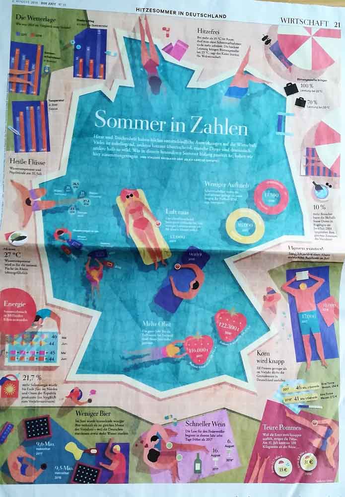
The following infographic tells the whole story (“Summer in numbers”). Without the illustartion, this would only be another bullet-point list of the topic, and probably not be very interesting for the readers. The artwork, however, is eye-catching and adds value to the reader because they can find the corresponding information next to icons and illustrations. It is an easy read, and having the illustrations next to it, the whole story becomes more interesting.
I then also looked at the magazine “VEGAN WORLD”‘s Ocean issue, and found that in contrast to the newspaper, they include a lot more illustrations to accompany the stories.
")
")
")
I then looked into some other examples of editorial illustrations that can be found on the web. The website Medium presents a list of editorial illustrators with a few examples of their work. This overview helps understand that editorial illustration is a broad field of styles, and cannot be limited to one technique or approach to a topic. More example can be found here.
CreativeBloq and Adobe Create Magazine, for instance, also give a few tips on how to become an editorial illustrator, and shows some further examples on their article here and here. I guess one of their main tips is to build a great portfolio with a variety of works and styles that could potentially work for different clients. I think that’s something on my roadmap, too. Besides the coursework, I aim to free some time to also create “my own” artwork, and editorial pieces on different topics.
The next step for this exercise is to create my own editorial illustration on a parcticular topic. The lists includes several topics, and I decided to illustrate the topic of “Finding your family history”.
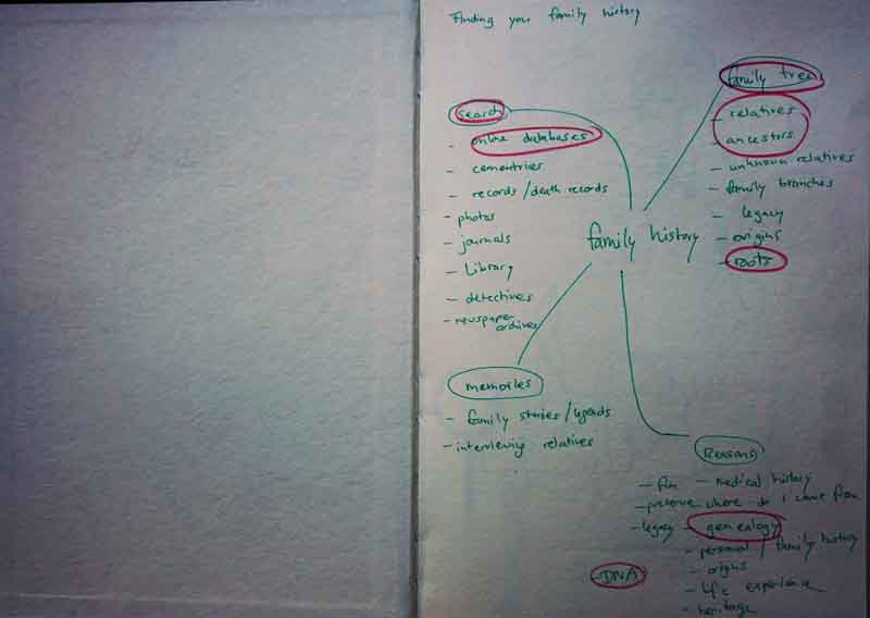
To get an idea about the topic, I did a bit of reading and decided to use these article as the basis for my illustration. Texts include various sources and can be found here, here, here, here or here. In also started to create a spider diagram and mindmap with the key words of the articles.
I also took a look at what other illustrators have created on the topic “family history”. It seems that the most common idea is the family tree, which is of course also part of our language and already provides an image for your mind. Some examples of illustrations can be found here, here or here. This image shows the family tree of Queen Victoria, and while it is really old-fashioned, I like the monochrome look, and how the photographs are included in the tree. The tree is very packed with the images and symbolizes the queen’s great family. However, the whole image seems to be “light” in a way and there is enough room to breath. A more modern version includes pictograms of men and women that are commonly to represent the gender on public toilets. The figures are “aged”, and represent a creative approach to visualize a family tree in a more contemporary manner.
Then I started to scribble some first ideas that came to my mind in my sketchbook. It is not very coordinated, but I just brought some first ideas to paper. They include the family tree, some faces, some lines to visualize DNA, among others.
")
")
")
")
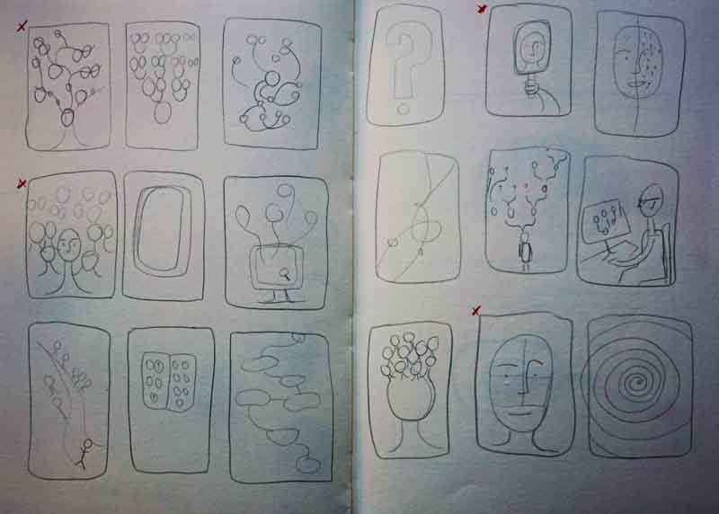
I created a few thumbnails to look at different options in more detail, and worked out four ideas that I liked best. I created somewhat larger thumbnails to visualize the idea also in colour to get a better understanding if things might work or not.
")
")
I continued with experimenting with a different materials and textures, to see what might work best for this particular artwork.
")
")
")
")
")
")
")
I tried out guache, which works well to get a tonal version of the greens and yellows; the watercolours are a bit to fluid; the ink is too bright to me in this case. I also experimented with some collague and stamps to see if I like the texture.
")
")
")
")
")
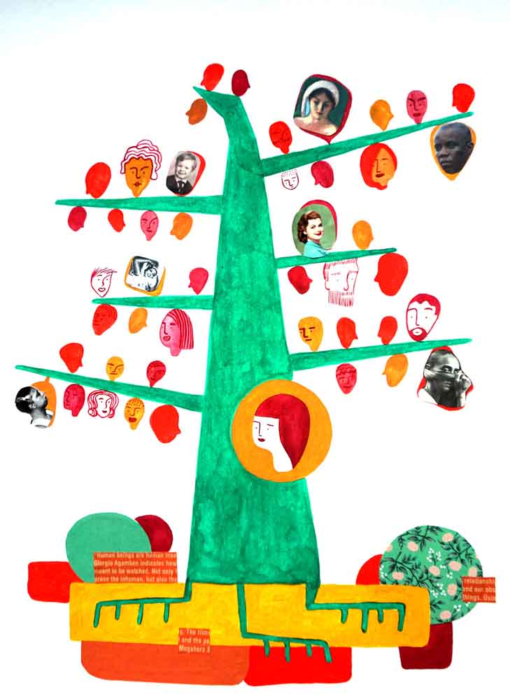
I then created an illustration mainly using guache, and a collage techniques with magazine cutouts. Here is the result, processed digitally to intensify the colours.
In the context of an magazine article, it would look like this.

Key Learnings:
- I enjoy working on editorial illustrations because I feel I can look at them with an open mind. The project seemed to give me the freedom to work on this topic creatively, and it turned out to be something different than I initially thought it would be.
- The topic I chose was quite challenging in terms of I did not quite know what I should best illustrate.
References:
- Creativebloq.com “5 steps to becoming an editorial illustrator” published on Dec 17, 2013. URL
- Adobe Create Magazine. “WHAT ART DIRECTORS WANT: TIPS FOR EDITORIAL ILLUSTRATORS” by Jenny Carless. Published on April 20, 2016. URL
- Medium. “25 Editorial Illustrators We Love”. Published on Aug 25, 2016 . URL
- Google Image Search. “Editorial Illustration”. URL
- Nationalgeographic.com. “8 Tips to Find Your Family Tree”. Published on Dec 8, 2017. URL
- Aplaceformom.com. “25 Reasons to Learn About Your Family History” by Caitlin Burm. Published on May 13, 2014. URL
- CNET. “Three ways to research your family tree” by Dennis O’Reilley. Published on March 24, 2012. URL
- Thoughtco.com. “10 Steps for Finding Your Family Tree Online” by Kimberly Powell. Last Updated on Jan 14, 2018. URL
- Google Search. “Finding your family history illustration”. URL, URL, URL, URL, URL
- Familyhistoryservices.com. “Victoria Family Tree”. URL
