
After getting some distance to this exercise, I went back to it to do some experiments with Photoshop to discover different effects would have.
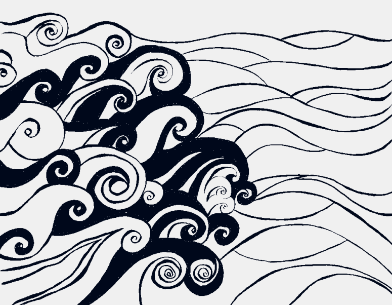
I started out with filling in the shapes in the white version with black.
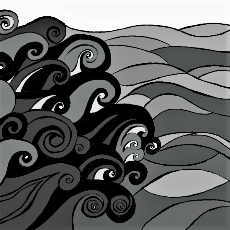
I then filled it in with different shades of grey. I like this one, but it’s probably a bit too dark. To see how it would look in colours, I also tried it out with shades of blue. I think this is a great example for me to understand that if a piece works in black-and-white, it would also work in colours.


I continued with some more experiements, with inverting colours, filling in different parts of the piece, or using the waves against a different background. I also tried out different formats than the landscape format. I used portrait and square dimensions to see how it differes.


My faourite is the one that I did not expect from the beginning. It does not have the sea anymore, but only uses the waves in portrait format. The focus is now fully on the waves, and they draw the viewer in.
Compared to my initial line drawing, the final versions is more simplified and focuses on the lines, rather than the shading of the individual waves. The focus is now clearly on the waves, not also on the background. In comparison, the line drawing has equal focus on waves and sea background. This is also because I changed from a landscape to square format because I felt it worked better. The piece looks more graphic now, because of the fact that is is lines only. I believe it could work well as a lino or woodblock print.
")

The exercise also asked for other illustrators’ works that appear graphic. I asked what does graphic actually mean, so I looked up it’s definition. According to the Reverso Online Dictionary , “graphics are drawings […] that are composed using simple lines and sometimes strong colours” (Reverso Online Dictionary).
I feel that many illustrators nowadays work in a graphic way, also because of the tools that are available to them. Working with Adobe’s Illustrator and creating vector graphcis automatically leads to having a more “graphic” look and feel. I think this is because there are no that many shadings, and you work with geometrical forms and lines, rather than with pencil drawings and other materials, which create a more in-depth-look.
The design school Canva actually presents several examples on how to design using black-and-white only, which I find very inspiring because it gives me ideas on what is possible. Focus on lines, using white space, and inverting images, using bold lines and symmetry, geometric patterns and shapes, and most importantly, keeping it simple. The latter is an important tipp in my view because I often tend to overload an image. Using black-and-white only helps me to focus on the most impotant things in a piece, and I want to start working more in black-and white only. Another tip that comes from Creative Bloq is to use different shades of black. I tried to use black and shades of grey, to have some variety in my illustration. Another point of view stated on DigitalArtsOnline is that monochrome pictures get right to they point and convey the idea righ away. I guess there is no distraction from any colours, so you both focus on lines and shapes to convey an idea, but also when viewing an image, you don’t get lost in colours that are not necessary.
One artist that I like who uses black-and-white graphic illustration together with some colours is Mele de la Yglesia. Her wavy lines and shapes she creates are rather flat, but still very dynamic. This appeals to me greatly. I also enjoy the fact that she adds colour splashes to her work, or uses coloured lines instead of black-and-white.
I also looked at include Tim McDonagh. His portfolio includes many illustrations that use bright colours, yet his work always places a strong focus on the (out)lines and shapes of a particular motif. I could image that his illustrations, especially ones like the Michelle Obama portrait work well in black-and-white.
Some other examples include any artist who works with lino cuts or woodblock prints, see some here. The results from printmaking always have a graphic look because they place the complete focus on the lines and there is no shading within one colour. You have to add another layor to add new shapes or any type of “shading” when working with lino prints.
Key Learnings:
- The number one learning I’m taking away from this exercise is that if an illustration works in black-and-white, it will also work in colour, and vice versa. I had never thought of this before, but it makes total sense to me
- Working on a graphic illustration means focusing on lines and shapes, and simplifying things
- When you get stuck with an exercise or assignment because it does not work out like you want it to be, take a step back and leave it, and come back to it later. This worked for me. I felt more inspired to experiment with this on my PC after I let a few days pass
- Experiment. I enjoyed creating the different versions of the same piece, simply by inverting colours, colouring somethings in, others not. Doing it on the PC meant I could do this easily and relatively quickly (compared to if I had done the same offline). I aim at developing my Photoshop editing skills too over the next few months, so I will be able to do even more
- Looking at other illustrators’ work helps me understand what I like and what I don’t like, and what elements I could adapt in my work. Especially the linocut prints are something I find quite intriguing. I have worked with this technique before, and have attended a printmaking workshop earlier this year. However, I feel this is an area I’d like to explore a bit more in depth
References:
Reverso Online Dictionary, 2017. Accessed Nov 12, 2017. URL
Canva, 2017. Accessed Nov 12, 2017. URL
Digital Arts Online. “37 tips for brilliant black-&-white art” by Lisa Hassel, published on Feb 2, 2017. Accessed Nov 12, 2017. URL
Design Modo. “30 Highly Detailed Black and White Illustrations”, published on Dec 17, 2011. Accessed Nov 12, 2017. URL
Creative Bloq. “9 tops tips for drawing in black and white” by Bobby Chiu, published on Sept 28, 2017. Accessed on Nov 12, 2017. URL
Creative Bloq. “10 amazing illustrators working in pen and ink”, published on April 1, 2014. Accessed on Nov 12, 2017. URL
Drawcutinkpress.com. “Top Linocut Artist to follow on Instagram”, published on Feb 27, 2016. Accessed on Nov 12, 2017. URL

3 thoughts on “Key Steps in Illustration: Using Black and White, Pt. 2”